TIP: Boost User Experience By Adding Hyperlinks

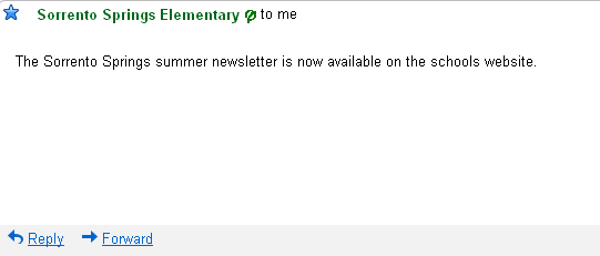
I got the above email from my daughter's grade school the other day. Sure there are many things that could have been added to this email to get my attention like what the newsletter contains, that there is important information I need to know, maybe even a line from the person or organization that sent the message. Not to mention the CANSPAM Act mandated unsubcribe links or a physical address.
But the one thing that could save this email is a hyperlink.
All the schools are given long URL's containing some combination of edu/us/k12/kitchensink. I can't ever remember it, and even if I do, now I have to hunt for the newsletter link.
I appreciate that schools are embracing technology, and I give them points for trying, but next time send me a link please.
A good rule of thumb for them, and you too, is "When in doubt hyperlink."
Are your emails useful? Is your site easy to navigate? Do you take the guesswork out of how to find information on your site?
